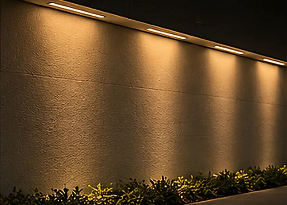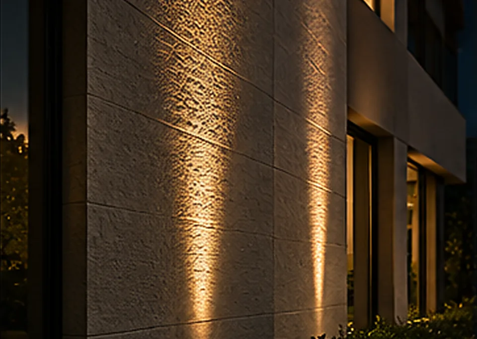
A slab of stone can feel completely different under two lighting arrangements. Under broad, even illumination, you might notice its colour and overall pattern. Bring a beam close to the surface and every ridge, pit and irregular edge can become visible.
Neither is the “true” appearance of the stone. Light is part of how the material is experienced.
For architects and interior designers, that makes lighting direction as important as the fixture itself.
Start with the character of the material
Wood has grain, colour variation and a finish that may be matte, satin or glossy. Stone can be rough, honed or polished. Concrete may be deliberately textured—or it may be intended to look smooth. Each surface responds differently to light because it reflects and scatters light differently.
Before choosing a spotlight or profile, decide which characteristic you want to show. Do you want strong texture, a gentle wash of colour, warmth in the grain or subtle separation from nearby surfaces?
Grazing reveals; washing calms
Grazing light skims along a wall or surface from a relatively close position, making raised areas bright and recesses more shadowed. It's a powerful technique for textured stone, brick and timber, but it can also exaggerate construction imperfections.
Wall washing aims for a more even illuminated field. It can make a wall feel broad and visually calm, particularly where the architecture needs a background rather than a dramatic focal point.
The terms describe intentions rather than one universal installation dimension. The required fixture location depends on surface height, geometry, beam distribution, setback and finish. For a critical wall, a mock-up is far more reliable than copying a photograph.
Wood: texture without unwanted shine
A warm timber panel can look rich under carefully chosen light, but the result is shaped by grain direction, finish and beam direction. Light placed parallel to the grain may emphasise one set of details more than another. A glossy lacquer can turn a pleasant accent into a distracting reflection.
Test from where people will actually see the wall, especially from nearby seating. The brightest effect isn't always the most attractive.
Stone: decide how dramatic you want the relief
Rough stone often benefits from directional lighting because shadows describe its depth. But excessive grazing may make a feature wall look restless and draw attention to uneven installation joints. A softer or wider treatment can sometimes achieve a more sophisticated balance.
Polished stone is a different problem. It may reflect the source or nearby luminous lines. Here, the reflected view from normal positions can be as important as the light striking the stone directly.
Concrete and plaster: inspect the workmanship
Minimal concrete and plaster surfaces can look exceptionally beautiful with quiet lighting. They can also reveal every trowel mark and change in flatness when lit at a shallow angle.
Coordinate with the surface contractor before installing grazing lights. If a wall was never prepared for raking illumination, no amount of fixture quality can hide the construction defects that the lighting makes visible.
Choosing the luminaire
Consider optical distribution, control of the visible source, colour quality, finish, mounting method and service access. The most appropriate fixture might be a recessed COB, a carefully placed profile, a linear wall washer or another purpose-designed luminaire. It depends on the material and the desired field of light.
Don't decide based on the fixture name alone. Review the beam on the actual surface. Keep the planned light colour consistent with the material presentation, but don't confuse CCT with colour-rendering performance.
The simplest useful experiment
Take a sample of the intended material and light it from two directions. First use a broad frontal source, then a more directional source from the side. Look at how the texture, shadow and colour appear. Repeat with the intended viewing angle.
That small experiment can answer questions a mood board cannot. Once you have seen the effect, the specification becomes clearer and the project has a better chance of looking deliberate rather than accidental.
Keep a record of the test
If a sample works, note the light's actual model, optic, aiming position, distance, material and exposure conditions. Photograph the setup as a reference, but remember that the camera may change the apparent contrast.
Those small records help prevent a familiar problem: the final installation looks different from the approved mock-up, yet nobody can remember exactly which component or placement created the original effect.
Architectural surfaces are not passive backgrounds. They are part of the lighting composition. The art is knowing when to reveal their texture—and when to let them be quiet.
Explore the lights: Architectural lighting · Outdoor lighting
Have a lighting requirement? Ask us on WhatsApp.